8.6 KiB
CSS Tweaks – Polished UI for Trilium
A set of CSS styles to improve readability and elegance of the TriliumNext interface.
Installation
- Import
CSS_Tweaks_UI_Polished.zipas an appearance note (or create a Code – CSS note with the code and apply it via settings). - Adjust the styles to your preference.
- Add the label
#appCssto the note's attributes.
Original link
https://github.com/orgs/TriliumNext/discussions/9553
🌟 Key Features
1. General Polish & Scrollbars
- Minimalist Scrollbars: Slimmer scrollbars (6px) with a transparent track and a subtle thumb that perfectly matches your current theme's border color.
- Theme-Aware Selection: Highlighting text now uses a beautifully tinted color mixed from the main text color.
- Fixed Card Links: Corrects opacity issues on card links, ensuring titles remain bold and legible while adding a smooth hover underline effect.
2. Sidebar & Note Tree (Launcher & Fancytree)
- Centered Launcher Icons: Fixes padding conflicts to ensure left-sidebar icons are perfectly sized (14px) and centered.
- Refined Note Tree: Increases padding and border-radius for tree items, making them more clickable and modern.
- Active Note Highlighting: The currently active note receives a prominent blue background badge on its title and a solid left border on the node, making it impossible to lose your place.
- Sleek Hover Effects: Smooth background transitions when hovering over notes in the tree.
3. Obsidian-Style Text Editor
- Spacious Typography: Increases line height (1.9) and margin spacing for paragraphs and lists to improve readability.
- Prominent Headers: H1, H2, and H3 tags are bolder and feature increased top and bottom margins for distinct visual hierarchy.
- Auto-Hiding Toolbar: The CKEditor top toolbar now fades out (50% opacity) when you are just reading, and fully appears (100% opacity) when you focus on the editor or hover over it.
4. Card View Enhancements
- Responsive Grid: Introduces dynamic auto-fill columns with proper gaps (12px) to prevent cards from touching each other on desktop.
- Flat Design: Removes default box-shadows in favor of clean, subtle 1px borders with rounded corners (8px).
- Better Padding: Increases inner padding for more "breathing room" around the text.
5. Elegant Kanban Board View (V3)
- Translucent Columns: Columns use a color-mixed semi-transparent background.
- Color-Coded Headers: The first 5 columns automatically receive distinct, beautifully colored top borders (Blue, Orange, Teal, Red, Purple).
- Interactive Cards: Board notes feature a subtle hover lift (
translateY) and border color transition. - Refined Add Buttons: "New Item" and "Add Column" buttons have dashed borders and soft background colors on hover.
6. Colorful Table View (Collection View)
- Auto-Coloring Columns: The first 15 columns are automatically color-coded with distinct, harmonious hex values for extreme data clarity.
- Clean Borders: Uses semi-transparent borders for cells and headers to avoid a cluttered look.
- Row Hover Effects: Entire rows softly highlight when hovered.
- Refined Resize Handles: Column resize handles only appear on hover to keep headers looking clean.
7. Mobile Optimization
- Single-Column Cards: Forces card views into a single column on mobile screens to prevent text from being squished or cut off.
- Hidden Code Blocks in Cards: Hides
<pre>and<code>blocks within card previews on mobile, as long lines of code (like shebangs) often break the card layout. - Always-Visible Editor Toolbar: Bypasses the auto-hiding editor toolbar on mobile, as touch devices don't have a "hover" state.
- Horizontal Scroll for Tables: Markdown tables now automatically scroll horizontally on small screens to prevent the entire page from breaking its width.
- Scaled Typography: Dynamically reduces font sizes for titles, headers, and UI elements to fit perfectly on smaller viewports.
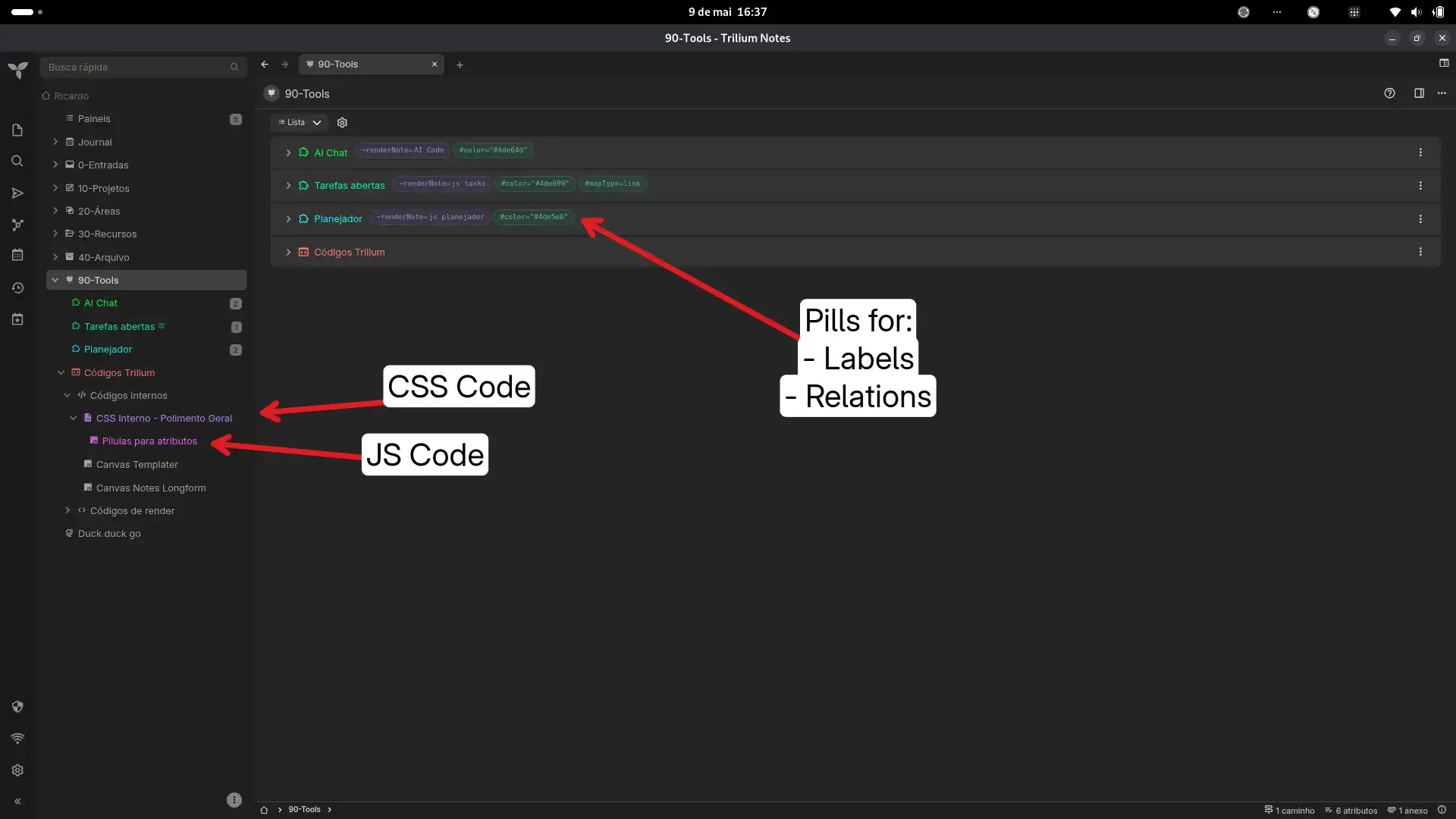
8. Promoted Attributes & Tags
- Attribute Table Layout: Transforms standard promoted attributes into a clean, aligned table layout (
Label:Value). - Rounded Pills: Note attributes in the list view are transformed into beautiful rounded pills with a monospace font.
- Labels (
#): Rendered with a soft green background and border. - Relations (
~): Rendered with a soft blue background and border.
Context: When a note uses the collection type with List view, attributes shown on the right side of each item are rendered as a single raw text string inside .rendered-note-attributes — something like:
~renderNote=AI Code #color="#4de64d" #subtreeHidden
There's no per-attribute markup, so CSS alone can't target individual labels or relations. This snippet uses a small frontend script to re-parse and re-render those strings as styled pills, then CSS to style them.
How it works
The .rendered-note-attributes span contains a mix of raw text nodes and <a> anchor elements (for relation targets). The script walks those child nodes, identifies labels (#) and relations (~) by their prefix, and rebuilds the element as a sequence of individual <span class="attr-pill ..."> elements. A MutationObserver watches for new list items so it works dynamically as you navigate.
A configurable HIDDEN set lets you suppress noisy system attributes (like #color, #subtreeHidden, #iconClass) that are already expressed visually elsewhere in the UI.
Setup
1. Frontend Script
Create a new note of type JS Frontend and add the attribute #run=frontendStartup.
Paste the following code:
const HIDDEN = new Set(['subtreeHidden', 'color', 'iconClass', 'viewType']);

function parsePills(el) {
  if (el.dataset.pillified === '1') return;
  el.dataset.pillified = '1';

  const pills = [];
  let pending = null;

  for (const node of el.childNodes) {
    if (node.nodeType === Node.TEXT_NODE) {
      for (const part of node.textContent.split(/\s+/).filter(Boolean)) {
        if (pending) { pills.push(pending); pending = null; }

        if (part.endsWith('=')) {
          pending = { type: 'relation', prefix: part, link: null };
        } else {
          pills.push({
            type: part.startsWith('~') ? 'relation' : 'label',
            prefix: part,
            link: null
          });
        }
      }
    } else if (node.tagName === 'A') {
      if (pending) {
        pending.link = node.cloneNode(true);
        pills.push(pending);
        pending = null;
      } else {
        pills.push({ type: 'relation', prefix: '~', link: node.cloneNode(true) });
      }
    }
  }
  if (pending) pills.push(pending);

  el.innerHTML = '';

  for (const pill of pills) {
    const name = (pill.prefix || '').replace(/^[~#]/, '').replace(/=$/, '');
    if (HIDDEN.has(name)) continue;

    const span = document.createElement('span');
    span.className = `attr-pill attr-pill-${pill.type}`;

    if (pill.link) {
      span.appendChild(document.createTextNode(pill.prefix));
      span.appendChild(pill.link);
    } else {
      span.textContent = pill.prefix;
    }
    el.appendChild(span);
  }
}

function processAll() {
  document.querySelectorAll('.rendered-note-attributes:not([data-pillified])').forEach(parsePills);
}

processAll();

new MutationObserver(mutations => {
  for (const m of mutations) {
    m.addedNodes.forEach(node => {
      if (node.nodeType !== Node.ELEMENT_NODE) return;
      if (node.matches?.('.rendered-note-attributes')) parsePills(node);
      node.querySelectorAll?.('.rendered-note-attributes:not([data-pillified])').forEach(parsePills);
    });
  }
}).observe(document.body, { childList: true, subtree: true });
Customization
- Pill size: adjust
font-sizein.attr-pill(e.g.0.8em) andpaddingas needed. - Hidden attributes: edit the
HIDDENset in the script to add or remove attribute names you want suppressed. - Colors: the green/teal tones are for labels, blue/purple for relations — change
rgba()values freely to match your theme.
Notes
- Tested on TriliumNext with List view on
collection-type notes. - The
MutationObserverhandles dynamic navigation without needing to reload. - This does not affect other note views (Book, Grid, etc.) — only
.rendered-note-attributeselements are targeted.
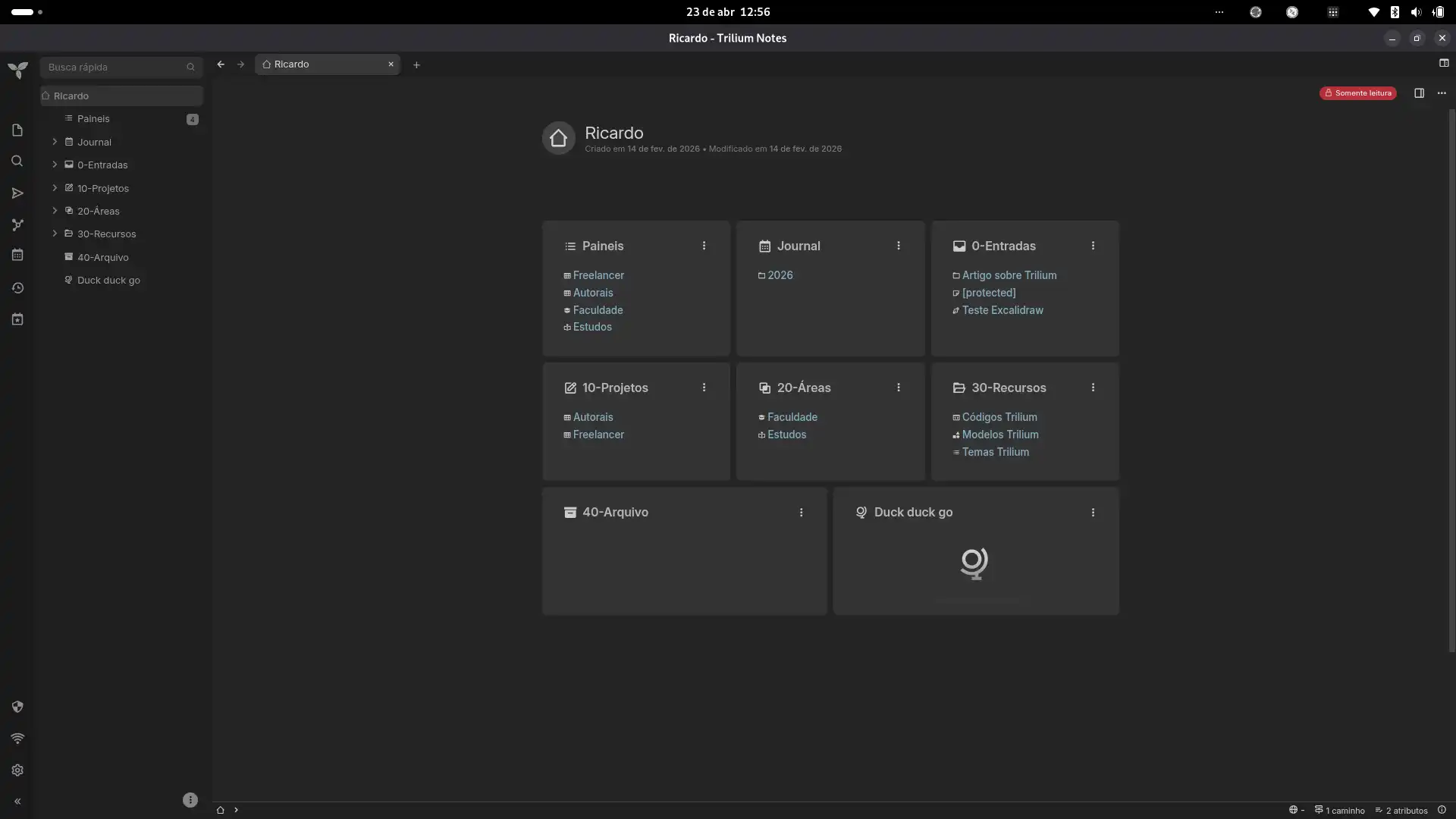
Screenshots